SAVR
Savr was a modified GV design sprint process. This solo project was to take place in the span of 5 days. The goal was to work on an existing recipe app and make adjustments to the recipe instructions as users were having trouble following along with the directions.
Day 1- Mapping the problem space
Problem Space
The cooking app already exists but is recently losing some users as the instructions aren’t satisfying users. Users dislike the order of the steps not including prep work as it messes up the timing of the dish. They also want to see the progress of the dish as they’re cooking so that they know if they mess up beforehand. Many are hesitant to try new dishes and when they do try a new one they tend to stick to it for a while.
It seems that users Dan and Anthony have a similar problem. Dan wants to know if he’s on the right track halfway through and if Anthony feels like he makes small mistakes that end up changing the dish; if they could both check their progress on the way their challenge would be solved.
Possible End to End User Experience
Day 2- Sketching
Lightning Demos
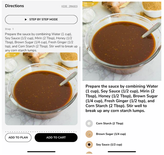
SideChef
Displays all necessary ingredients at the beginning of the page (not pictured) as well as its measurements and adjustable serving sizes. Shows an image of what the recipe should look like at each step. Also offers a step-by-step mode, which focuses in and allows users to better focus on each step
KptnCook
Displays all necessary ingredients at the beginning of the page (not pictured) as well as its measurements and adjustable serving sizes. Shows an image of what the recipe should look like at each step and what each ingredient should look like when going into the pot too.
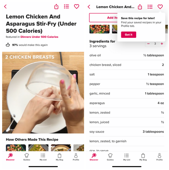
Tasty
Has the video form recipe at the top and ingredients list underneath. The ingredients are responsive to the adjustable serving size.
Crazy 8s
I ended up using a version of solution 5 as I thought it would be the most helpful for users unsure of what their meal should be looking like in between steps. I decided to change the image to a video to best help users who don’t understand the instructions and wanted to go back to see where they went wrong. It was also important to display what the ingredients looked like to the user, as they might not yet be familiar with the ingredients, especially when trying new dishes.
Solution Sketch
Day 3-Storyboarding
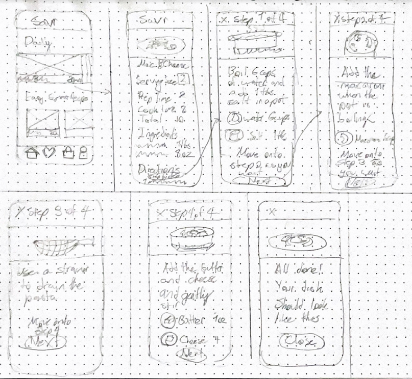
The screen that shows the recipe instructions is by far the most important screen as the users have trouble with the process of creating the dish. This storyboard shows the process by which a user would be clicking through the app.
First, the user would choose one of the daily featured recipes, then click on the step-by-step mode under the directions. This mode will take them to a pop-up screen where they can navigate through the steps using the next button on the bottom. At any point, the user can click on the x in the corner and leave the pop-up screen.
Day 4 Prototyping
The prototype is meant to simulate a recipe app. Only the red route of the actual recipe instructions has been created as this was the main problem SAVR wanted to focus on. There were issues with people able to follow along or to get the instructions right when it was all text-based, so now there is the option of going into step-by-step mode, which allows you to follow along the steps in video form breaking down each step. There is also a visual representation of what the ingredients look like, which may help people working with a new ingredient. My goals are for people to be able to follow along with the recipe. I’m not sure how to test this without asking the participants to actually cook, but I will ask if it feels manageable and their confidence level in preparing this dish with no experience. Another challenge I see is that there is no actual video attached to my prototype, only video stand-ins, which may trip up some users.
Day 5- Testing and iterations
Usability study
Usability interviews went well; I received permission to record from everyone and this was all done remotely. Most users seemed more confident in their ability to follow the recipe after going into step-by-step mode. Many participants had more suggestions for how to improve recipe find-ability, but as that is not the current problem space being worked on, I will store that information for a later date. One participant said she loved the step-by-step feature, as she found it tedious to have to rewind the video several times for a single step, and this made it easier to access. She also enjoyed that the ingredient amounts were shown on each step as well. Another participant suggested breaking up the paragraph text in the step-by-step mode as bullet points, to make it even easier to follow. Lastly, for UI, one girl mentioned that she would prefer that the NEXT and BACK buttons weren't stacked, as it would be easy to misclick; she would prefer the buttons to be on either side of the back (left is back, right is next).
SAVR Redesign
I included the changes from the usability test for the redesign and replaced the image for step 4 to be more accurate of the step’s instruction


